Archive

HNC

This week, we explored some more photographic techniques.  Building on the photogram work from last week in the darkroom and using the enlargers.

We started by distressing negatives, literally taking some of the ones we’d got from our medium format shoot then scratching and burning them!  We then started with the same 5 second test strips as before to find the correct exposure, then onto a full A4 print:

Distressed negative 5 second test strip

Distressed negative 5 second test strip

Distressed negative A4 print

Distressed negative A4 print

Something else we also did was to use various bleaches and dyes to colour photographs and photograms.  I used one of the photograms that I had done the previous week using nuts and screws:

Coloured photogram

Coloured photogram

With our next HNC unit we’ve moved away from using a camera, to looking at some of the historical process’ and creative techniques that are available.  These are not necessarily about getting the best, sharpest image, but making something creative.

We started in the darkroom looking at Photograms.  This is a process of placing objects onto photographic paper and then using an enlarger to shine light onto the arrangement, thus creating a negative.  This is then developed using the darkroom chemicals.

To get the correct exposure time, as with developing a negative, a test strip is done where card is used to gradually shade less of the photographic paper so that exposures of 5, 10, 15 etc. seconds can be seen.  This process can be repeated if necessary with different enlarger settings.The best time is then chosen for the final image.  (Below are scans of photo paper after developing)

Photogram 5 sec test strip

Photogram 5 Second gap test strip

Photogram Sun Catcher A4

Photogram full size. Sun catcher and fixings

We then repeated the process with negatives that we had shot before on medium format camera’s:

Photo develop 5 sec test strip

Negative 5 second increment test strip

First Developed A4 Photo

Negative A4 print


Note: Quick edit, got a Merit for the project, really happy with that!

So, after a pretty successful 1st studio shoot I was keen to make some adjustments and improvements  to my theme.  My main aim was to make the product look bigger and get some champagne in the glasses.

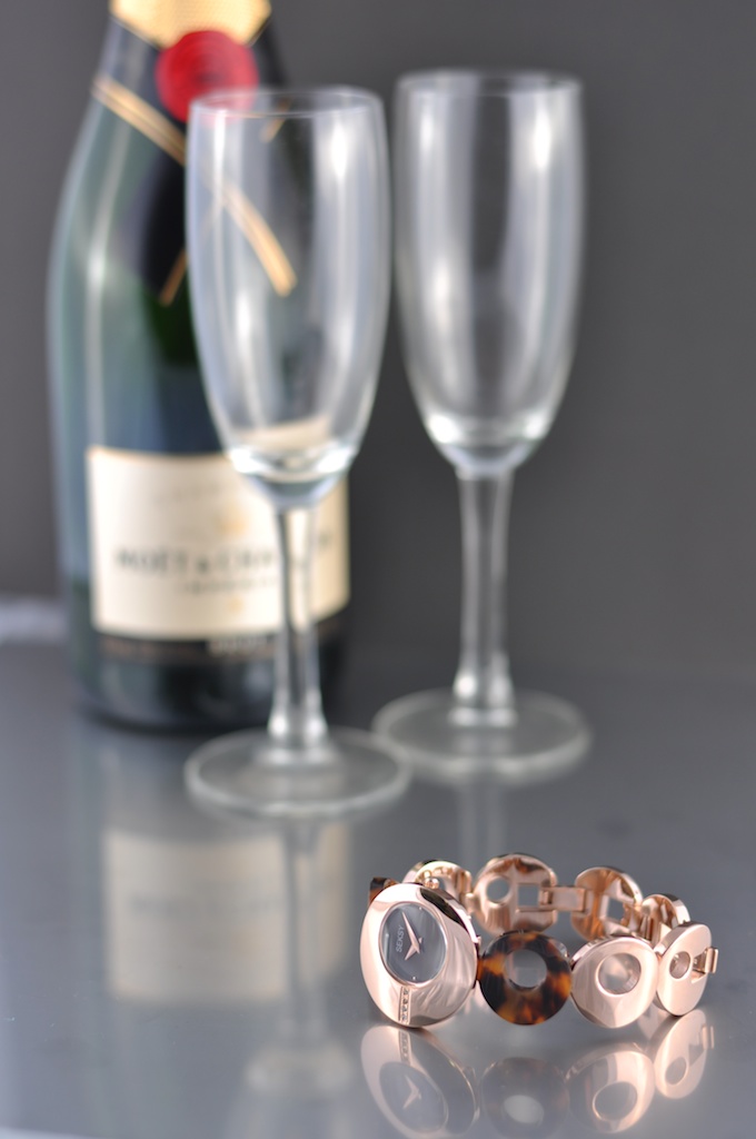
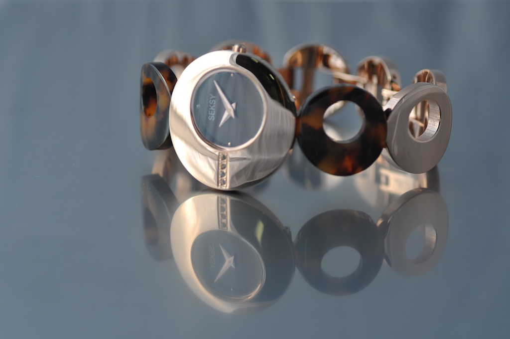
I started without champagne trying to set the shot up.  I really struggled to get what I wanted because the sheet of stainless steel I was using was too short.  I couldn’t get the champagne bottle and glasses far away enough to get the right angle.  Also, because the black cloth on the table and the background on the wall were different blacks I was getting a bit of a striped effect:

Sekonda FS striped (1)

I then tried getting rid of the stainless steel and pulling the black cloth up over an object in the background to give a more consistent colour:

Sekonda black background

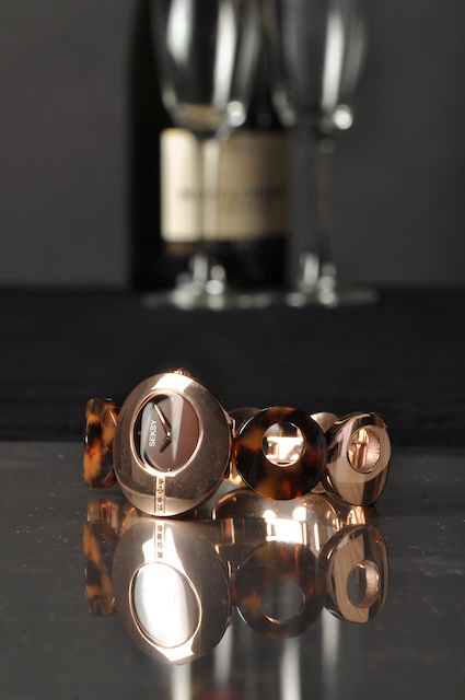
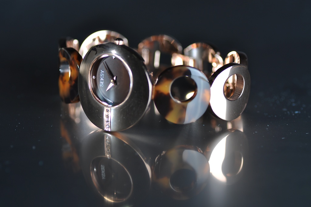
These looked better.  It then took me a while to rotate the watch to try and avoid reflections and adjust the position of the champagne bottle of glasses.

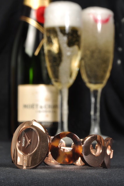
I then tried some champagne in the glasses and another student suggested putting lipstick on and drinking of one glass, which was a nice touch.  So my best shot from the day, before ‘photoshopping’ was:

Best Pre PS

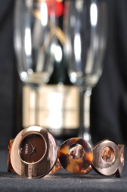
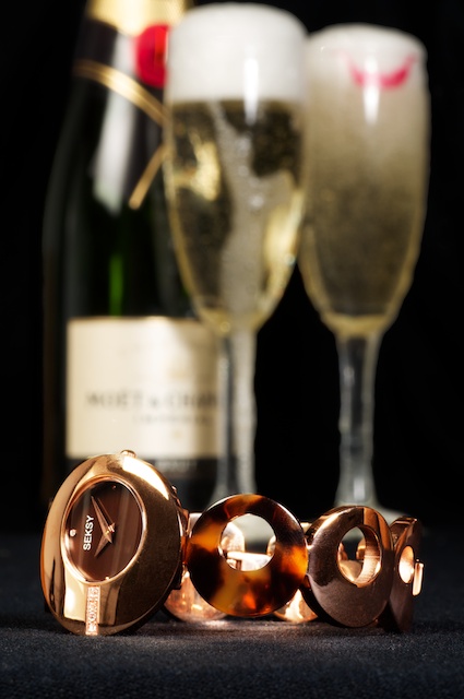
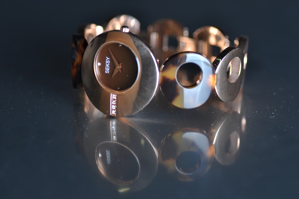
After some photoshopping to remove scratches, dust specs and some other adjustments my final image:

Best Post PSI’m still a little frustrated by some of the reflections, but am very happy with my work to remove some of the marks and the dark ‘seksy’ look i’ve given to the watch.

All handed in and awaiting marking now…

One final thing:

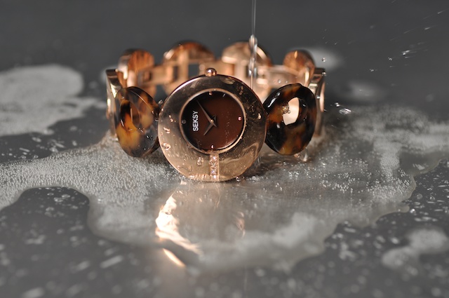
At the end of the shoot, after sampling the champagne.  We decided a shot of the watch on the stainless steel, surrounded by champagne would look nice:

Seksy ChampagneWe we’re quite pleased in the end!

Our next HNC photography project is studio based.  Sekonda have lent the college a selection of prototype watches.  These were randomly allocated to us.  We have to then take a shot to go in a fictitious Argos pullout.

Below is a selection of my favourites from my first shoot:

Watch 1st Shoot 1

I think this is my favourite shot so far. Need have have some bubbly in the glasses though. Might also try and ‘compress’ it all a bit, get things a bit closer together so the watch is more prominent. Seeing as that’s what i’m advertising.

Watch 1st Shoot 2

I quite like the ‘dreamy’ look of this shot. Although it is a little boring and doesn’t tell much of a story about the watch. Seeing my camera reflection in the watch face is also a little frustrating.

Watch 1st Shoot 3

Really should have wiped the stainless steel first, you can see all of the little specs of dust!

Watch 1st Shoot 4

Edit:- Received a Merit mark for the project, so very happy!

So, hand in date today for the Press Photography assignment.  For each half of the assignment I was asked to choose four images, burn them to a CD and print an A3 of my main image.  This ended up being four images for National Allotment Week (Shoots One, Two and Three) and Four for Remembrance Sunday (Shoot One and Two).  I did the majority of my work at home, burning pictures to disk, adding contact sheets and comments to my sketch book.  The last bit I had to do was use the college Mac’s and Printer to get the A3 prints.  This went well as I got in pretty early and I felt quite a weight lifted when the work was handed in.  What with all the re-shoots printing and writing up what I’ve done. it’s taken up quite a lot of my weekends.  Looking forward to a few weekends off and Christmas.

I think the next thing on the HNC is studio photography, so looking forward to that.

For my main Allotment shot I chose:

Allotment_Shoot_Two 1

For my main Remembrance shot I chose:

Remembrance_Shoot_Three

The rest of the images are below: